
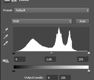
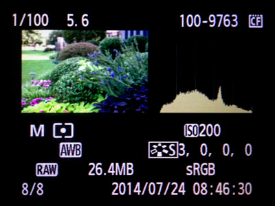
You have probably seen a chart like the ones below before. These charts may appear on your camera LCD after you have taken a photo, like the one on the left. If you have done any post-processing at all it is commonly displayed there as well. The chart to the right was displayed in Photoshop.
You may have ignored this chart in the past, but once you get to know it, this chart will become like your new best friend. I personally use it all the time. It is called a “histogram” and it tells you the exact exposure values for your picture.
It looks much more complicated than it is. In this post I show you what it is and how to use it.
A Histogram is Just a Bar Graph
A histogram is just a bar graph and each bar is a specific lightness value of pixels within your picture.
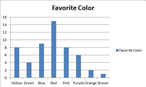 First, let’s make sure we all remember bar graphs or bar charts. Do you remember these things from grade school math? They are charts with rectangular bars, with the lengths of each bar corresponding to the amount. Your teachers made you measure inane things and then make a bar graph of it. I’ve got a simple example on the right.
A histogram is just a more detailed version of these bar charts. The bars on the left side of the histogram are the darkest pixels in your picture and the bars on the right are the lightest. There are 256 separate bars in the graph, and they are lined up from 0 (the darkest value, basically pitch black) to 255 (the lightest value, solid white).
So basically, a histogram is a graphical representation of the exposure values of the pixels in your image. We’ll talk about how to read or interpret the histogram in a second. But you may be wondering why you need this histogram at all when the image already appears on your LCD after each shot. Couldn’t you just look at the image and make any necessary corrections?
You can to a point, but the histogram is more precise. Plus the LCD is unreliable, and the histogram is not.
There is No “Right” Histogram Shape
 Because there are so many bars in the histogram and they get put right next to each other, the chart usually appears to take on a shape. People will sometimes try to read things into the shape of the histogram. For the most part, however, you really don’t need to worry about what shape your histogram is in.
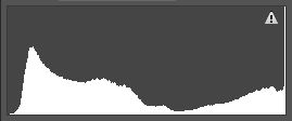
But you do need to worry about where the pixels or bars are grouped. For example, if the histogram is pushed to the left or has a “spike” on the far right side, you can tell you either have a very high-key picture, or – more likely – you overexposed the picture.
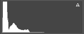
 Notice on the histogram to the left that there is a “spike” on the far right side of it. That means there are a whole bunch of pixels that have been overexposed to the point of turning pure white. When we look at the corresponding picture below that histogram we see that, indeed, this picture is overexposed and the sky is almost completely “blown out.”
Conversely, if your histogram is bunched up to the left, you either have a very low-key picture or – more likely – you underexposed it. Recall that the left side of the histogram is the darker pixels.
Notice in the histogram to the right that the bars are all bunched on the left side of it. There is a spike to the far left of the histogram and there are no pixels on the right half of the histogram at all. We would expect a very underexposed picture and, indeed, that is what we have in the corresponding picture (also to the right).
 These are pretty extreme examples to illustrate the point. The take-away is to use the histogram as a guide to make sure you are not “clipping” your highlights or shadows too much.
A histogram is sometimes referred to as being “healthy” if it looks like a bell-curve, with the tallest bars in the middle, tailing off evenly to each side, with no spikes at either end. That histogram will often produce a nice picture, but do not get too wrapped up in the shape.
 How to Use the Histogram
I recommend that you set up your camera so it displays the histogram on the LCD after each picture. You don’t necessarily need to look at it after every picture, but if you have any questions about the exposure of your picture, look at the histogram, not the picture on the LCD. The main thing to look for is just to make sure that the histogram is not pushed to one side. Again, remember that the picture on your LCD is unreliable, the histogram not.
You should also take a look at the histogram when you have your pictures on your computer. That will give you a good idea of any adjustments that need to be made. In fact, as you progress on to the point of doing some post-processing of your pictures, the histogram will be the foundation for your most of you changes.
Using the histogram is going to make you more precise with your exposure. Your photography will be better as a result. Maybe not a world better, but better. Be sure you are checking it as you shoot and you will start avoiding pictures with exposure problems.