
Some photographers want to know the details of the scientific process by which their camera captures and renders color. I don’t.
Other photographers get particular about very slight differences in shades of color, and will seemingly fuss over slight color changes for hours in an effort to get exactly the right shade. I confess, I really don’t do that.
It is not that I don’t care about color – I do. Very much. But I care about it only insofar as it can improve my and your photography to a significant degree. Further, I worry about people getting sucked into rabbit holes on certain aspects of color, getting intimidated, and then shying away from what is a very knowable subject. So I want to focus you on the important things and what I think you should concern yourself with as to color.
When it comes to color, what I think you as a photographer should know right away are:
- how digital color works in very general terms,
- which color scheme you should use for your camera and post-processing, and
- the best ways to enhance or alter your colors in Photoshop and Lightroom.
So those are the things that I’m going to talk about in this article. Color doesn’t have to be overly technical, and you don’t need a particular “eye” for color. I hope that this introduces you to the topic of digital color and gets you started on your way to mastering it in the future.
First up, let’s talk about how color works in your digital camera and in your computer. But don’t worry, this won’t be technical.
RGB Color: The Basic Stuff
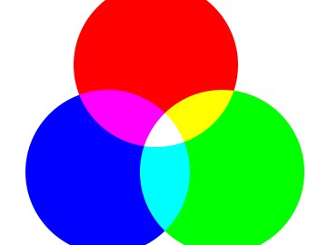
Your camera captures and renders color using something called “RGB color.” RGB stands for Red, Green, and Blue. That name gives you a pretty good idea what this scheme is all about. In the RGB colorspace, all color is rendered by combining some shade of red, green, or blue.
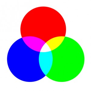
This might not make sense to you at first. My first question upon learning of the RGB colorspace was how in the world you could make yellow out of these three colors. Yellow is considerably lighter than red, green, or blue, so it would not seem that any combination of these colors would succeed in making yellow. What I was missing – and what I don’t want you to miss – is that there are many shades of each of these three colors, all the way from almost white to almost black.
Think about how your camera captures color this way: imagine that when you press the shutter button your camera is actually taking three different versions of the exact same picture:
- One version is all in red, as if it was shot through a red filter.
- One version is all in various shades of green.
- And the third version is in various shades of blue.
Then your camera combines each of these three versions into one picture. The combination accurately renders color. That’s not exactly how it works in your camera, but if you think of it this way you will really never go wrong. 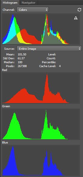 Because, in fact, that is ultimately what you will end up with. The color in your camera and on your computer is rendered in three “channels”:
- a red channel
- a green channel and
- a blue channel.
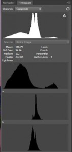
Both your camera and your software will create a histogram for each of the three channels (for example, in Photoshop, select the “All Channels View” of the histogram). An example is set forth to the right.
You can also see each of the 3 histograms by opening a Curves Adjustment Layer and using the drop-down labeled “RGB” to look at the individual channels. This will be important later because the best way to manipulate color in Photoshop is via a Curves Adjustment Layer using these individual color channels.
But that need not concern us yet. All we need to worry about now is that color is rendered in your camera in the RGB colorspace in three different channels. There are, however, different formats for rendering RGB color, and deciding on which one to use will be our next topic.
Choosing the right RGB colorspace
Your camera will likely allow you to choose from shooting in a couple of different RGB colorspaces, usually sRGB or Adobe RGB. Then Photoshop and Lightroom will allow you to choose between rendering your color in sRGB, Adobe RGB, or Pro Photo RGB, among other color spaces.
Before We Choose . . . Some Perspective
Some photographers spend a lot of time wondering which RGB colorspace to use in their camera and in their post-processing. In just a moment, I will tell you which RGB colorspace(s) I think you should use. But before we get there, to add some perspective to this question, take a look at this picture and then answer a few questions about it.
Here is the picture:
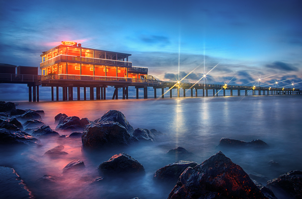
Now identify which RGB colorspace the camera used when this picture was shot.
In addition, see if you can correctly state which RGB colorspace was used in the edit process in Photoshop.
You cannot tell, can you? Of course you can’t. Nobody can. I cannot (without looking at the metadata) and I’m the one that took the picture and edited it.
But that’s the point. And I don’t mean to be flippant about this, but a lot is made over the relative size of various RGB colorspaces, and it just doesn’t matter to your actual photography that much. If you have problems with color in your pictures, I can almost guarantee the source of the problem is not your choice of RGB colorspace.
RGB Options in your Camera
With that said, let’s look at the options you have. In your camera’s menu, you likely have two options for the RGB colorspace: sRGB or Adobe RGB.
sRGB: For all practical purposes, this is the “standard” RGB colorspace, and the one the whole world of computers is built around (I believe, but have not confirmed, that the “s” actually stands for “standard”). It was originally proposed by HP and Microsoft, it is very widely used in internet, video, and computer circles. It is the smallest of the colorspaces we will examine, but for purposes of computers and monitors, that does not matter because sRGB contains all the colors that can be shown on most computer monitors. As a result, most photographers recommend that you use this colorspace if you plan to display your photos online.
Adobe RGB: In 1998, Adobe introduced Adobe RGB, which is a broader colorspace than sRGB, meaning it contains more colors spaced across a broader range. Because it is broader, many photographers urge its use. In particular, it was designed to cover most of the colors achievable on printers. Some argue that it does not always render color on monitors accurately though.
When it comes to making a decision between these two colorspaces, most experts urge you to stick with sRGB unless you know you will be doing a lot of printing, in which case go with Adobe RGB. I concur.
I will leave it at that, but if you want to delve into this subject further, I am including links to comparisions done by others here, here, and here.
RGB Options in your Software
The largest RGB colorspace, meaning the one that has the most color options, is called Pro Photo RGB. This will likely not be an option in your camera, which is why I have not mentioned it until now. But if you are shooting in Raw, your camera should capture enough data to make using this colorspace worthwhile. Most expert photographers recommend using this colorspace, and I concur. If you are using Lightroom or Photoshop to edit your photos, I would set them up to use the Pro Photo colorspace. Here’s how:
Lightroom: In the Edit drop-down menu, choose Preferences. In the resulting dialogue box, click on the External Editing tab, and find the Color Space drop-down. If it is not already set to Pro Photo RGB, choose that option.
Photoshop: In the ACR screen that opens when you open a Raw file, click on the camera information below the picture. In the resulting “Workflow Options” dialogue box that pops up, there will be a Color Space option. Choose Pro Photo RGB.
In summary, I recommend you stick with sRGB in their camera unless you are focused on printing your images, in which case you might choose Adobe RGB. I also recommend you choose Pro Photo RGB for Lightroom and Photoshop, assuming you shoot in Raw (otherwise you can stick with sRGB). But these are not set in stone, and your pictures will likely be fine whichever option you choose.
But, having made that decision, it is now time to consider the best way to go about enhancing or changing colors.
Enhancing and Changing Color
When it comes to enhancing or changing colors in your picture, there is essentially a “good,” “better,” and “best” way to go about it. It may seem that you should just jump to the “best” way, and that might work for you, but I think most photographers will want to work through these steps. I suspect that many can use the “good” option to great effect without worrying about anything else.
In the remainder of this article, I’m going to touch on the options and show you the tools you will want to use in Lightroom and Photoshop (including Elements). I will not have a step-by-step tutorial for these tools (that is for another day), but rather just want to guide your thinking about which tools you should choose.
The Good Way
Those just getting started with photography should probably use exclusively the “good” method. That method consists of two very simple steps:
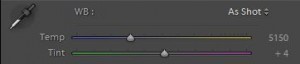 1. White Balance: You can cure any color cast through the use of the “white balance” tool in Lightroom or Adobe Camera Raw (“ACR”). The top slider will allow you to make the image more blue or yellow, and the bottom slider will allow you to remove any greenish or reddish casts.
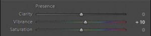 2. Vibrance: Use the Vibrance slider in Lightroom or ACR to enhance your colors. This can be done globally in either with a simple adjustment of the slider. It can also be done to particular parts of your picture in Lightroom by using the Adjustment Brush.
It should be noted that the saturation slider is to be generally avoided. It is a very blunt instrument.
In most cases these two steps will be all you ever need. The White Balance tool will cure most color casts. The Vibrance slider will add some pop to your colors when you need it. Rarely will you need more than this.
The Better Way
But when you do need something more to improve your color, there are other tools you can use. We will call this the “better” method.
This method consists primarily of two tools:
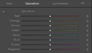 1. The HSL/Color/B&W Panel: For targeted color corrections, use the “HSL/Color/B&W” panel in Lightroom or ACR. Here you can choose from one of eight different colors, and you can increase or decrease the Luminance or Saturation of that particular color. You can also affect the hue. Unlike the general “vibance” or “saturation” sliders, which target all colors, this panel will allow you to focus on particular colors and make specific adjustments to them.
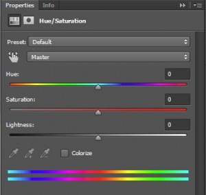 2. Hue/Saturation Adjustment Layer: For outright color changes, I would use the Hue/Saturation adjustment layer in Photoshop. This will allow you to target a selection and change the hue or saturation level of a given color. Being an adjustment layer, it also comes with a ready-made mask that you can use to only affect portions of your image. You can use this for slight adjustments to particular colors, but it also works for outright changes in color.
The Best Way
There is a clear “best” way to enhance or change color. That is through the use of Curves Adjustment Layers and going into the individual color channels. For adjustments to colors, such as the removal of a color cast, you will usually stay in RGB and adjust the red, green, or blue channels. To enhance or separate colors, you will often want to abandon RGB entirely and make adjustments to the individual color channels of the LAB colorspace. Here is how that works:
1. Making Adjustments in RGB: If you are trying to fix a color cast, or just adjust colors a bit, I would do this via a Curves Adjustment Layer in RGB. Obviously, that lets you add or subtract more reds, greens, and blues from the picture. But keep in mind that adding or subtracting red, green, or blue will also necessarily mean adding or subtracting the complementary colors for each of these (those complementary colors are cyan, magenta, and yellow). In other words, if you reduce the amount of blue in an image or a portion of an image, you are necessarily adding more yellows. If you are unclear on this, do not worry, and we will cover this in the future.
2.  Enhancing Color in LAB: If you want to enhance the colors of your image, the best way is typically still a curves Adjustment Layer, but this time by going into LAB color. Talking about the LAB colorspace is beyond the scope of this article, but if you want to know more about it I recently wrote an article for Digital Photography School on the subject. Essentially, working in LAB will let you create separation between colors. It will also make the colors more vibrant, and do so without affecting the contrast of your picture.
Conclusion and Further Steps
So now hopefully you understand a bit how color is created by your camera and used on your computer. And now hopefully you have chosen an RGB colorspace to use in your camera and in your software. If so, we can put that behind us and focus on how to enhance or change colors.
If you are just starting out with photography, stick to changes in White Balance and Vibrance to cure and enhance your colors. Those two tools are very powerful and can really improve your photos. Add in the additional tools set forth above only as you see the need.
The goal here is not to answer all questions related to color or show you all steps involved, but to make it understandable and set you on a path toward thinking about color. It is a knowable subject. It doesn’t have to be overly technical. You don’t have to “have an eye” for it. Stick with me and we’ll master it together.