
An Introduction to Color Enhancement in Lightroom or Photoshop

Working with color may seem like something for interior designers, who can discuss differences between different hues that you don’t even see. But it is actually pretty easy to make dramatic improvements to your photos – even if you have no eye for color. In this article, I want to show you how easy it is. As photo editing tools have advanced, color correction tools have gotten simpler. Changing or improving color is now largely a matter of moving a few sliders around. Yet, at the same time, these tools are extremely powerful. In fact, many photographers now eschew the use of Curves and Layers in Photoshop and just use the simple color enhancement tools in Lightroom.
I will show you these tools in this article. It should be something of an introduction to color enhancement if you are just starting out. After introducing you to the tools, we’ll go through some specific applications you may face from time to time. That part of the article will be of more interest to those who are already familiar with the basic tools.
Incidentally, I should note that these tools are available no matter whether you use Lightroom or Photoshop. The examples in this article will be from Lightroom. The same tools appear on the Adobe Camera Raw screens that appear when you open your Raw file in Photoshop (and, for the most part, Elements). So you can do everything in this article no matter which software you use.
The Color Adjustment Tools
First let me introduce to to the tools available to you in Lightroom or ACR for color enhancement. If this seems basic to you, please bear with me. We’ll talk about using these tools later in the article. I am operating with a “no photographer left behind” philosophy, and I want to make sure everyone understands the basics before moving on.
Setting the White Balance
You are probably familiar with white balance, so I don’t want to get bogged down in it here (but if you aren’t familiar with white balance, check out this article). The white balance controls are the quickest and easiest way to correct most color casts in your pictures, so I want to give it a quick nod.
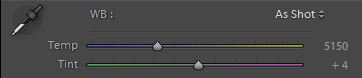
With the Temp slider, you warm things up by moving the slider to the right (adding yellow) and you cool things down by moving the slider to the left (adding blue). With the Tint slider you can add more green to the picture or more magenta/red. This is a powerful tool for correcting color casts. As we’ll see later, it is also powerful to changing colors to specific portions of the picture by using these sliders along with the Adjustment Brush.
The best way to set the white balance is to use the eyedropper tool. You just grab it, click on a neutral color, and it automatically sets the white balance for you. It work great, but even if it doesn’t get it right the first time, you can just click again.
Changing Saturation and Vibrance
After you have fixed any color casts, one of the next steps to take is to adjust the intensity of the colors. Very often, you will want to make the colors appear more saturated. The controls at your disposal are the Saturation and Vibrance sliders.
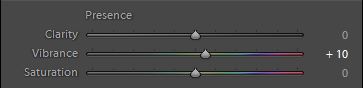
It might seem that you should use the Saturation slider to increase the saturation of your colors. However, the better practice is to use the Vibrance slider to do so and to leave the Saturation slider alone. Why? Because the Vibrance command will increase the saturation of colors while focusing on the most muted colors. It punches up the color where you need it. On the other hand, the Saturation slider increases the saturation of all colors equally. If you use Saturation, you will very quickly find yourself with colors that look toxic or psychedelic.
Another reason not to use the Saturation slider is that you can control saturation using finer controls. And that leads to our very next move, which is the saturation sliders for individual colors.
Controlling Individual Colors
You have the ability to change the saturation level, the lightness level, and even the hue of different colors. The panel labeled HSL/Color/B&W contains the sliders:
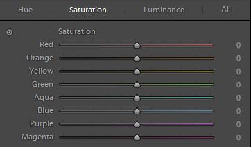
This is a very powerful panel of controls. To use it, you first select from Hue, Saturation, or Luminance at the top. If you have Hue selected, any changes you make to the individual color will change the color itself. With Saturation selected you increase or decrease the amount of saturation of that color. With Luminance selected you change the brightness value of specific colors. As we will see, the Luminance command is very important, especially when working on the skies of your pictures.
Once you have selected the effect, using this panel is simply a matter of moving the sliders for the individual colors up and down. The use of this panel will be different for each picture, depending on what colors are present. The best way to understand how it works is just to play with it. When you have your picture opened, just move the sliders up and down and watch the effects. To reset the color and move it back to 0 just double-click on the slider.
Adjustment Brush
The good news is that Lightroom and ACR have an Adjustment Brush that allow you to make changes to specific parts of your picture without changing other parts. It is powerful and easy to use. The bad news is that the color controls are pretty limited. In fact, there are only two: the while balance controls and the saturation slider.
You can, however, do a lot with just those two controls. Probably more than you think. Here is how they work:
- White balance – With the white balance you can obviously selectively warm up or cool down portions of your picture. That comes in handy. But the reality is that you can add blue, yellow, green, or magenta to any specific portion of your picture. That is powerful.
- Saturation – Selectively increasing or decreasing the saturation of colors in particular areas of your picture is also quite handy. You can already select individual colors using the sliders above. With the brush you can target discrete areas of the picture.
That’s it. You now know all the tools. There aren’t that many, and they aren’t very complicated. But the simplicity adds to the power.
Now let’s put these tools to practice and make a few adjustments.
Photoshop Elements
Most of these tools are available to Photoshop Elements users as well. However, two are not. Elements does not have an Adjustment brush in its ACR, and it also does not have individual color sliders in its ACR. As to the individual color sliders, there is a work-around. Once your photo is in Elements, call up the Adjust Hue/Saturation box (Enhance > Adjust Color > Adjust Hue/Saturation or press Ctrl+U). When you do, you will see the same hue, saturation, and lightness sliders discussed above when we were working within Lightroom. The default will be to Master, which will affect all colors, but you can click on that and it will bring up all the same colors as we used in Lightroom. You can thereby go about changing them in the same way as discussed above.
One tip is to make these changes on a new layer so you can undo or change them more easily. To create a new layer, just click Ctrl+J or go to Layer > New > Layer Via Copy. Now when you make the changes you will not be affecting the underlying image, but adding a layer that can be moved later.
Specific Applications
Now that you are familiar with the tools, let’s take a look at them in action. Here are some common actions you will take with your photos.
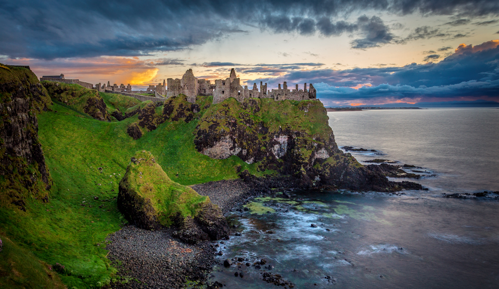
Mid Day Sky Enhancement
When you are photographing outdoors, the sky is a frequent visitor to your photos. In fact, it is nearly always present. Enhancing it is therefore something you will do time and time again. In fact, you will commonly face the same problem: how to make the sky a deeper, richer blue while making the clouds appear bright and puffy?
Here’s the answer: just darken the blues. Go to the HSL/Color/B&W panel, select Luminance, and pull the Blue slider to the left. That will darken the blues in your picture without affecting the other colors. Your sky will instantly look better.
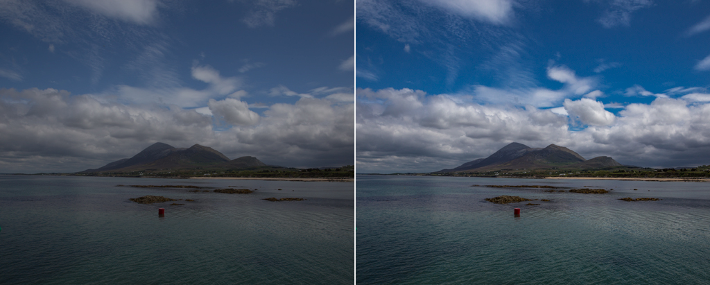
You may also have to adjust the clouds as well. If the sky is on the verge of being blown out, pull down the Highlights. If not, and the clouds can stand being brightened a bit, then push up the Whites. In the example above, the image was overall pretty flat so I brightened the whites quite a bit.
Dawn and Dusk Sky Enhancement
At dawn and dusk your skies will have additional colors in them. You can target these colors to bring them out and make your sky look much better. Typically, this will mean targeting the oranges and yellows. In some cases, there will be some reds you can adjust as well.
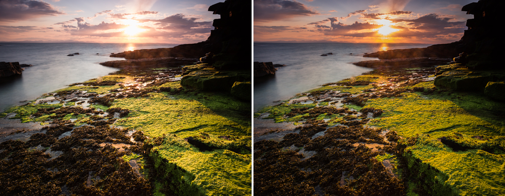
Start by targeting the blues as you did for the mid day sky enhancement. After that, increase the saturation of the oranges a little bit, then decrease the luminance of the oranges. Remember that you’ll be using the Orange slider, but setting the effect to either Saturation or Luminance.
After that, do the same thing with Yellows. That is, set the effect to Saturation and push the Yellow slider to the right. Then set the effect to Luminance and pull the Yellow slider to the left. If there are reds in your sky, do the same thing with the reds.
These changes will affect your entire picture. If there are other oranges, yellows, or reds in the picture that are adversely affected by your changes, you may need to make use of the Adjustment Brush. In that case, increase the Saturation using the brush, and then make the luminance changes using the color sliders.
Cloudy Day Sky Enhancement
The enhancements we just worked through won’t work in the case of a totally cloudy day. There just won’t be colors to target and adjust. The way to improve the sky in this situation is to add some color. Namely, blue.
Here’s how to add blue to your sky. Start with the Adjustment Brush. Select the brush, then pull the Temp slider in the white balance controls to the left (toward blue). When you paint, you will be adding a blue tint. Paint over the entire sky. When you are done, continue making adjustments to the Temp slider until the sky looks the way you want.
Avoiding Toxic Greens
Often times when you make global color adjustments you will find that everything looks great except one thing: the grass. You will need to enhance the color of other parts of the picture, but it will make the grass look psychedelic or toxic. If you back the global adjustment down, then the rest of the picture looks flat. So what to do?
The best answer is usually to make the global adjustment so that the rest of the picture looks good, without regard for how the grass looks. Then, decrease the saturation of the yellows in the picture. Do that by going to the HSL/Color/B&W panel, setting the effect to Saturation, and pulling the Yellow slider to the left.
Wait a second, you might think, shouldn’t I be adjusting the Greens to affect the grass? No, you read that right – you want to adjust the yellows. It is the yellow in grass that makes it look overdone. Toning down those yellows will usually bring the grass in line with the rest of the picture.
Warming Up
An easy way to warm up the entire picture is, of course, to adjust the white balance. You just pull the Temp slider to the right to add yellows.
Often, you will want to warm up a discrete portion of the picture. Sometimes, for example, there will be sun rays that you want to accentuate. You can do that in two different ways. First, you can add Saturation to the yellows as described above. You can also use the Adjustment Brush and add yellow (with the Temp slider) to a portion of the image.
Using the Color Enhancement Tools
Those are common color enhancements you will make to your outdoor photos. Pretty simple, wasn’t it? But these are powerful tools for managing color in your pictures.
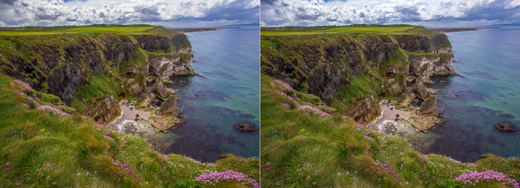
Of course, you’ll use these tools along with the brightness, contrast, and clarity tools in Lightroom/ACR to improve the picture in general. The changes to color will be just one aspect of your overall changes. For example, while I focused on a few minor changes in the picture above, here is the overall before and after of that shot – after all chances to brightness, contrast, sharpness, and – of course – color.

Add these tips to your workflow and your colors will improve markedly. There are other ways to affect color that are more complicated – and we’ll get into those in future articles – but for something like 80-90% of your pictures, I think the techniques described here are all you will need.
I am using Photoshop Elements 13 and do not see the HSL/Color/B&W panel that was mentioned in the article. How do I get to it?
I did not realize that Elements limited its ACR screens in this manner. Sorry about that!
To get there, you will need to take the photo into Elements and call up the Adjust Hue/Saturation dialog. To do that, press Ctrl+U or go to Enhance > Adjust Color > Adjust Hue/Saturation. You’ll see a dialog box with the same three sliders (hue, saturation, and lightness). It defaults to Master (meaning it will change all the colors), but when you click on that, all the same colors as discussed above will come up. Just pick your color and go to work.
I have revised the article a bit to reflect the restrictions on ACR within Elements. Sorry for my mistake and the confusion, and hope that helps.
Thank you fro getting back to me so soon. I really enjoy your articles and have learned a lot from them.
Hi Jim,
thank you for this article.
I’ve read a few times about colour controls in Lightroom but could never remember which was doing what. And even after a few tries, I didn’t see a real difference between them.
This time, I really think I get it. And the practical examples are a good help for that.
Again, thank’s.